Project
A kindergarten that has to look like one — and still do the paperwork
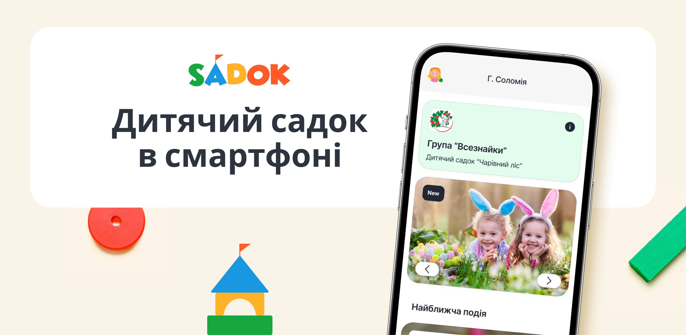
The brief called for mobile app design and UI/UX for a product with three audiences: parents drop in for a minute, a teacher works a full shift, the office keeps records and money. One visual language had to carry both the nursery mood and a table of invoices.
Client: Sadok.app
Scope: 100+ screens
Work: identity + UI kit
Platforms: iOS + Android
Identity
A mark that doubles as a letter
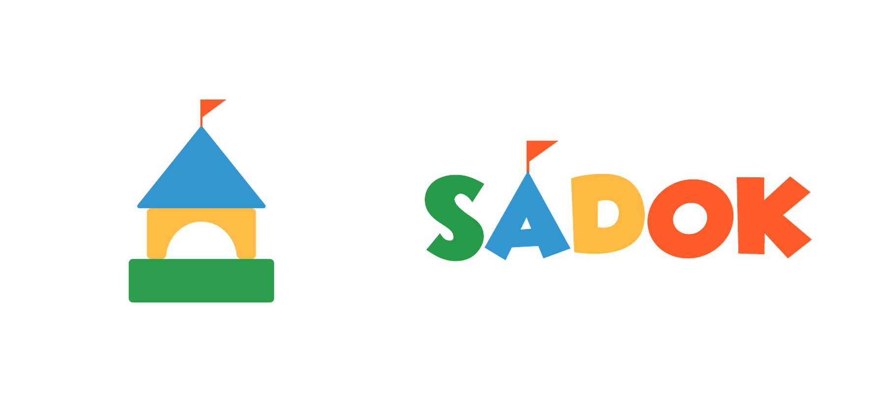
A little house made of building blocks reads as childhood without a single illustration. The same mark becomes the “A” in the wordmark, so the icon on the home screen and the logo inside the app read as one thing.
Mark and wordmark. In promotional material the same house is stacked from real toy blocks — the brand steps off the screen into an object.
Palette
Four colours, each with a job
#FD5C29
Action — buttons, accents
#3297D1
Information, navigation
The colours of the mark became interface states: orange asks for action, green confirms, blue explains, yellow waits.
Typography
Four sizes across a hundred screens
22 / 800Kalyna group
18 / 700Teachers
16 / 400A pre-school group for our youngest curious minds
14 / 400Teaching assistant · 7/10 children
A 22 / 18 / 16 / 14 scale. It never needed a fifth size, even once invoices and reports arrived.
The good part
Three screens that get opened every single day
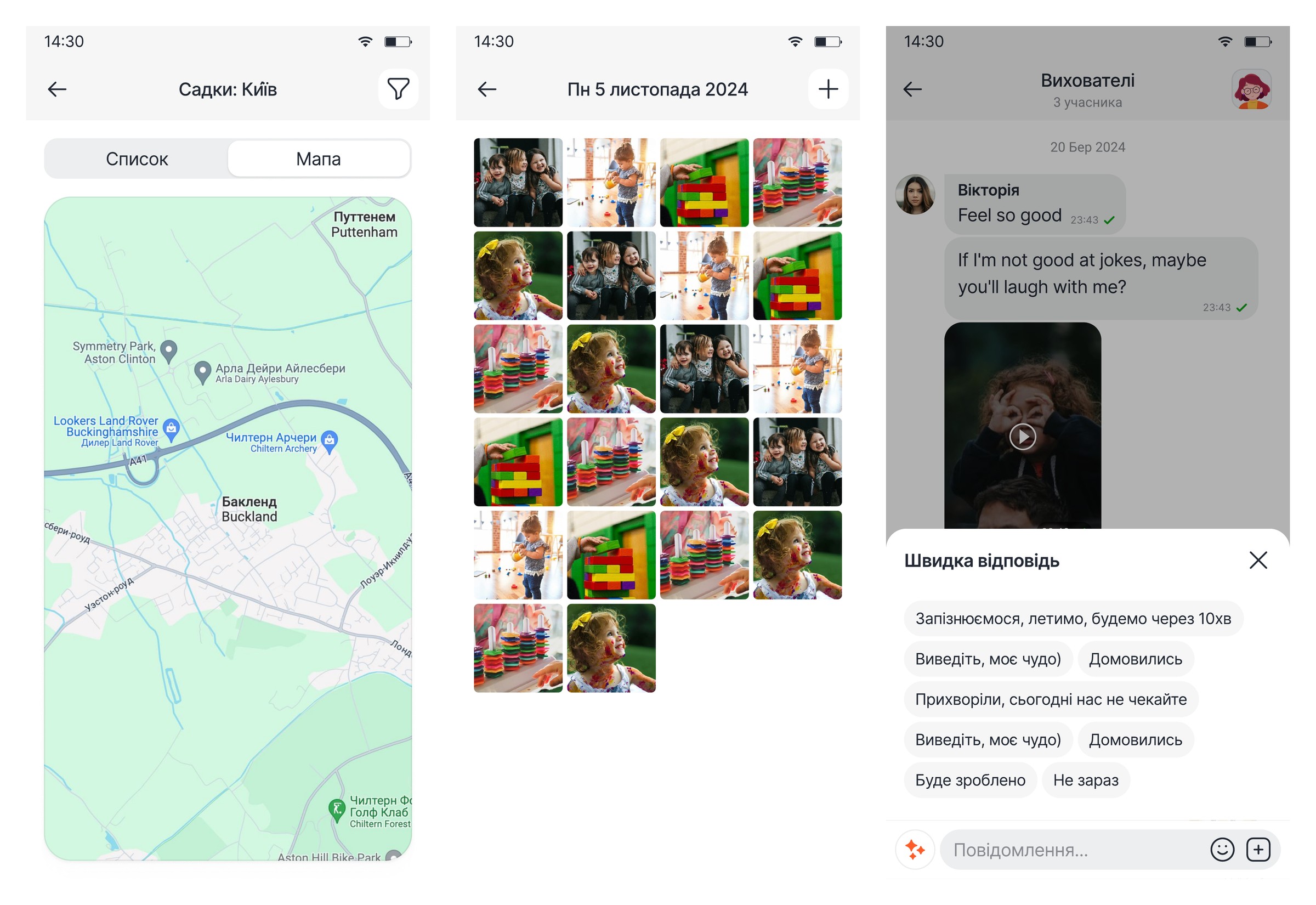
Left to right: kindergarten map — a list/map toggle, pins for each place and a city filter. Gallery of the day — everything photographed in the group, gathered by date, with no scrolling back through chats. Teacher chat — video notes in the thread and canned replies: “running late, ten minutes”, “he is unwell, not coming today”. A parent answers with one tap instead of typing while walking.
Services
We took the interface apart to show what it is made of
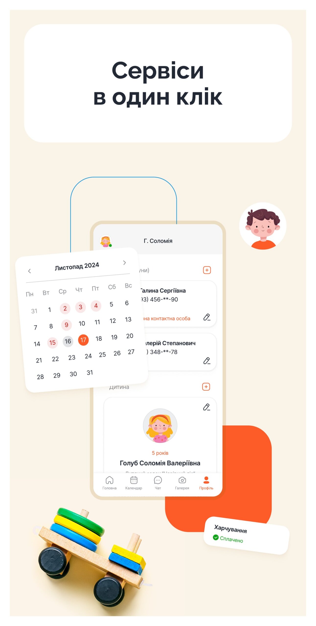
Calendar, child card and meal payment status — whatever a parent opens most often was pulled to the surface.
The rule at work
Every group takes on its own colour
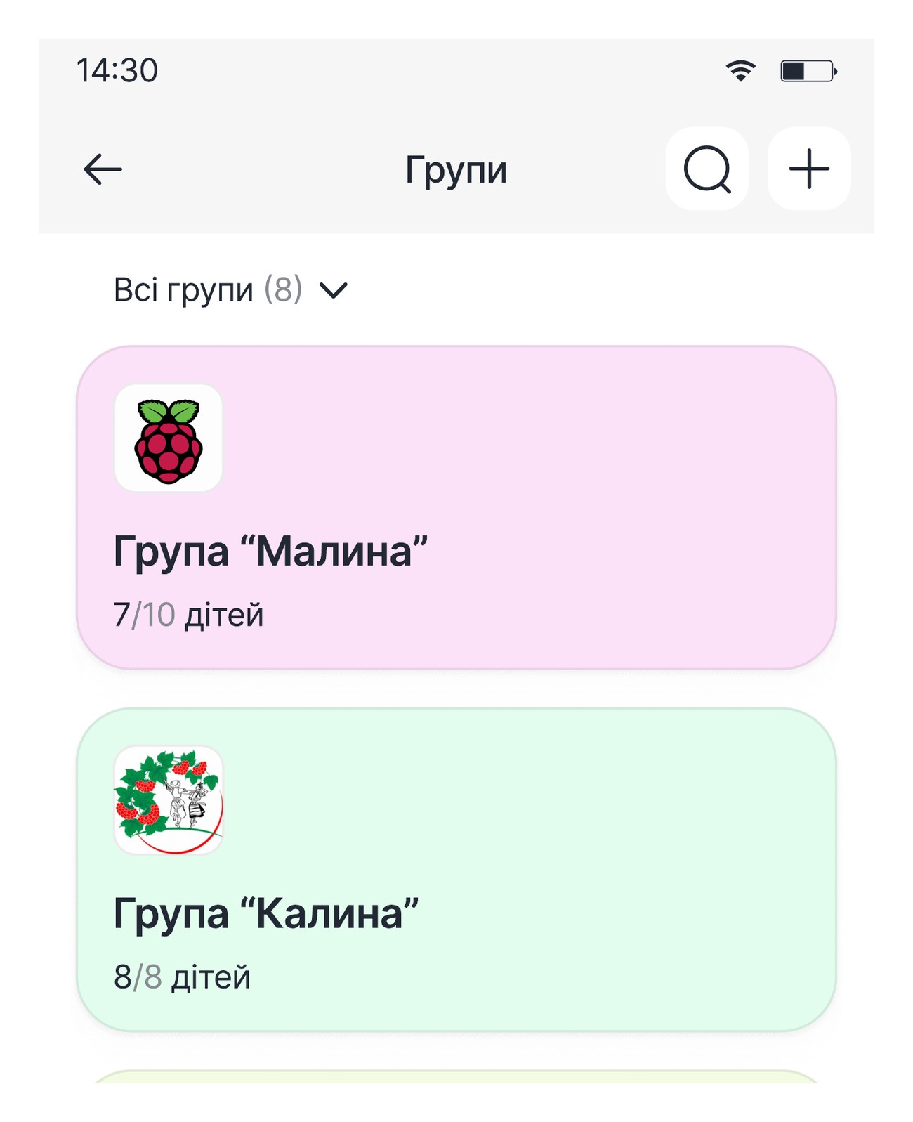
“Malyna” is pink, “Kalyna” is green. A card picks up the light tone of the main colour in its logo, so a teacher finds the right group by colour before reading the name.
Real content
A kindergarten is photos, events and numbers
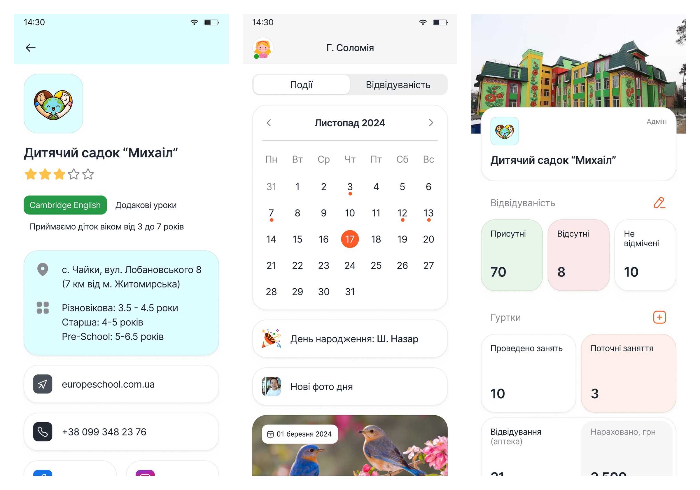
Left to right: kindergarten card — rating, distance and programme badges such as Cambridge English. Events calendar — birthdays, holidays and classes in separate colours. Admin dashboard — attendance, occupancy and club charges on one screen.
Avatars
Shape tells you what you are looking at
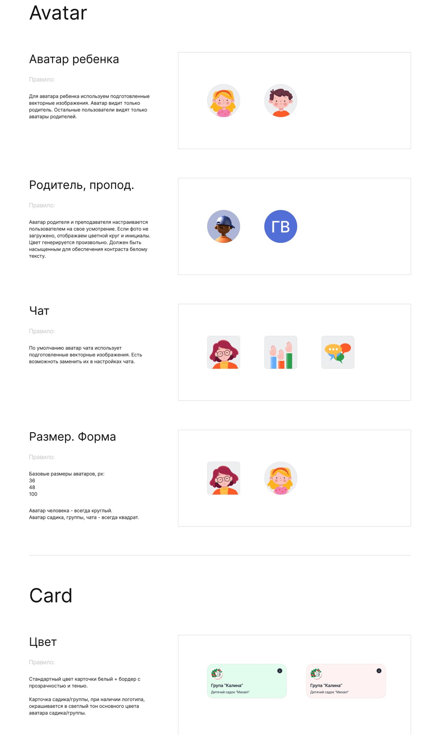
A person is always a circle; a kindergarten, a group or a chat is always a square. Sizes are fixed at 36, 48 and 100. With no photo, initials sit on a generated colour saturated enough to keep white text legible. A child’s avatar, meanwhile, is visible only to that child’s parent.
UI kit
Components with rules, not a folder of mockups
The specification page: every component carries a written rule rather than an example.
Icons
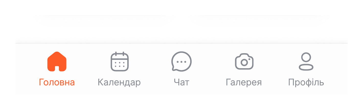
One line weight across the whole navigation
Home, calendar, chat, gallery, profile — same stroke, same optical weight, active state in orange.
Outcome
What we built it with
FigmaBrand identityApp iconDesign systemUI kitAccessibility
The real test came with the next module: when invoices and meals were added, almost nothing new had to be drawn. How all of it was assembled in code sits in the case study on building the app.
Need brand identity and design for a mobile app? Let’s talk about your project.
Order app design