
← Chyzh Agency case studiesCase study · UX/UI · Brand identity · Mobile
Case · Mobile app design
Sadok.app — brand identity and a design system for a kindergarten in your pocket
A mark built from toy blocks, the app icon and the interface of an app that parents, teachers and the front office live in every day.
Brand identityApp iconDesign systemUI kitiOS + Android
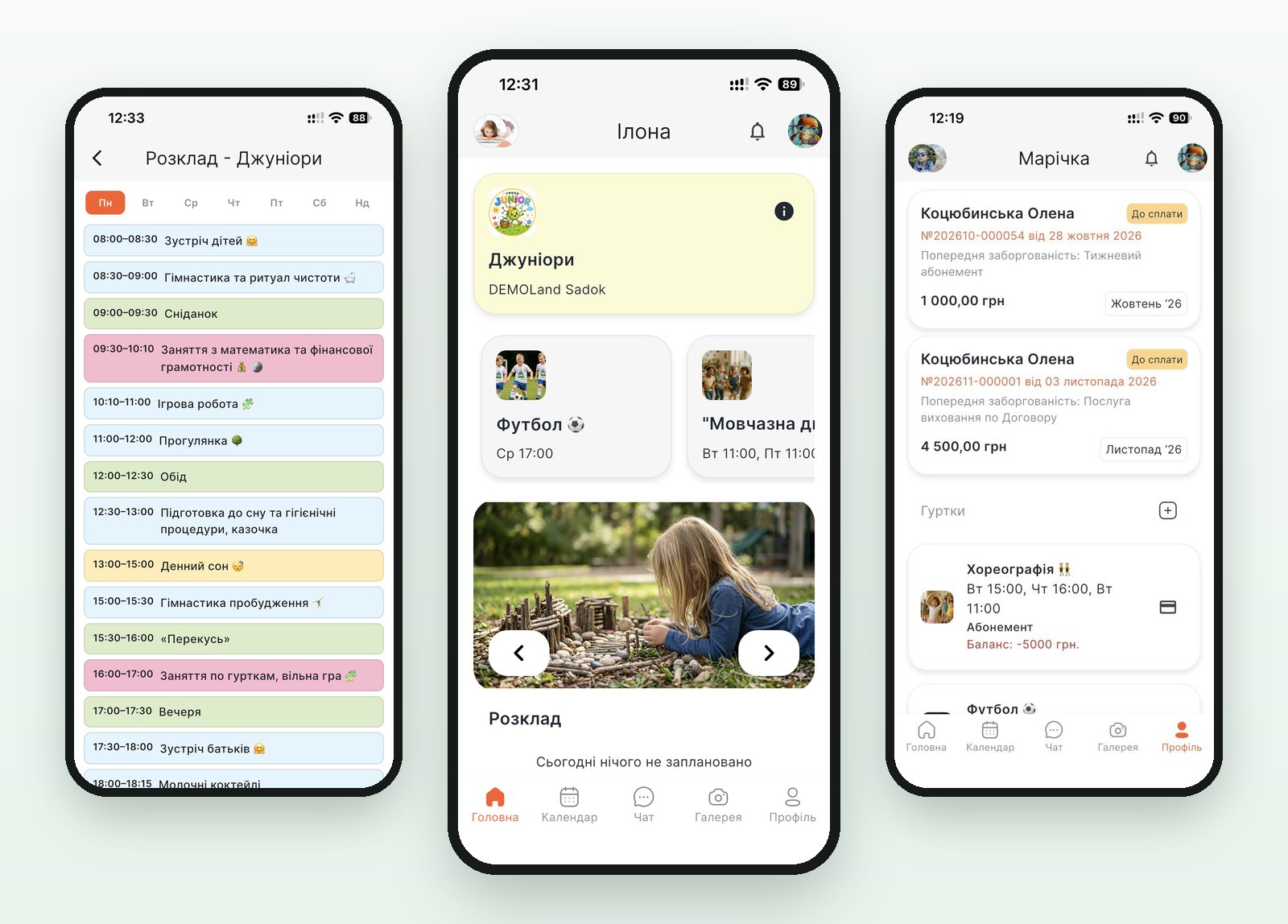
Project
A kindergarten that has to look like one — and still do the paperwork
The brief called for mobile app design and UI/UX for a product with three audiences: parents drop in for a minute, a teacher works a full shift, the office keeps records and money. One visual language had to carry both the nursery mood and a table of invoices.
Identity
A house of blocks: the mark and the app icon
A little house made of building blocks reads as childhood without a single illustration. The flag from its roof also sits above the “A” in the wordmark, so the icon on the home screen and the logo read as one thing.
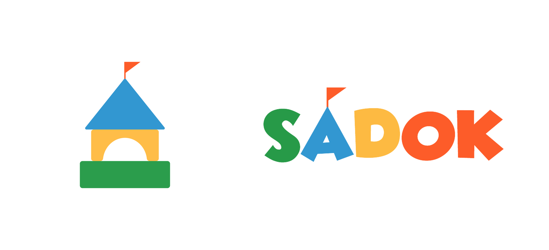
Mark and wordmark. The same house is the app icon on the phone, notifications included.
Parent app
What matters sits on the first screen
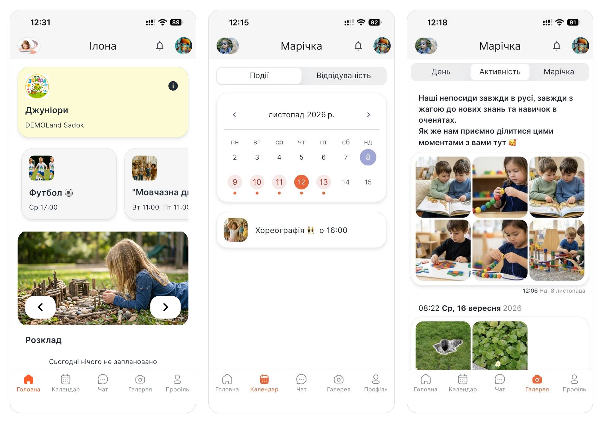
Left to right. Home: the child’s group, their clubs with photos and today’s schedule. Calendar: days with events marked in colour, the next class below. Activity: a post with photos from the group. Five navigation tabs along the bottom.
Colour in the schedule
The daily routine reads by colour
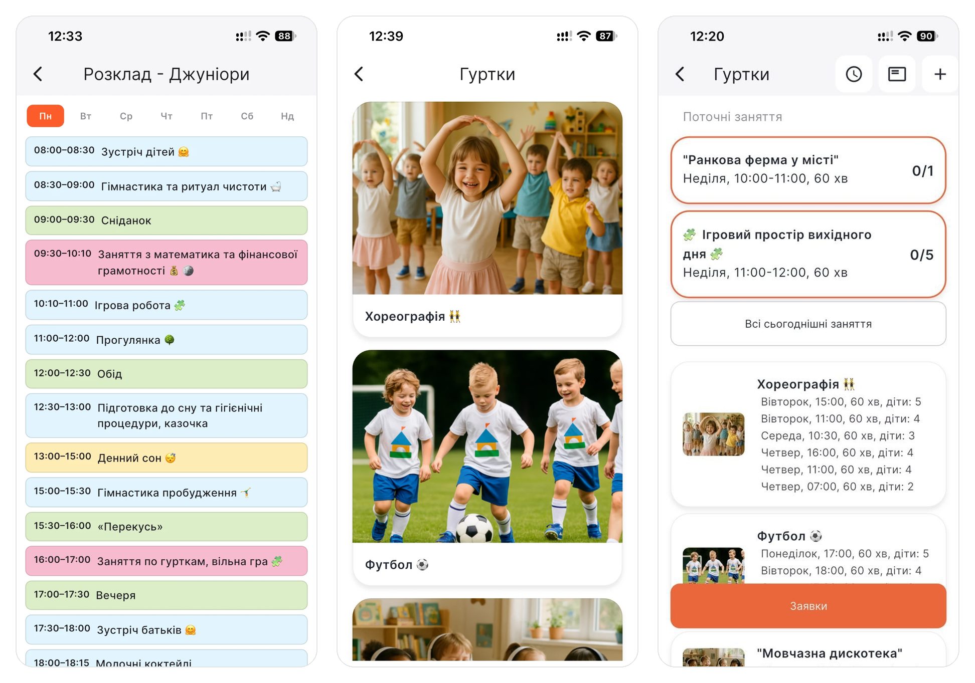
Group routine: meals, classes, nap time and the rest of the day are marked in different colours. Club catalogue with large photos instead of a list. Clubs for the staff: current sessions with a child counter and an orange «Заявки» (requests) button.
States
Attendance and debts show in colour
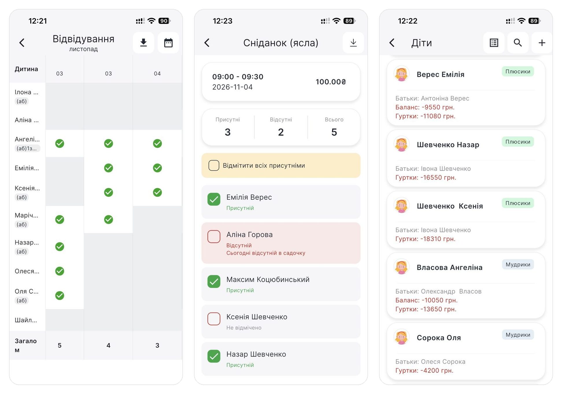
Monthly attendance: green ticks in the table. Breakfast in the nursery group: present children with a green tick, absent ones on a pink background, not yet marked in grey. Children: a negative balance for the kindergarten and clubs in red, the group as a tag next to the name.
Icons
One line weight across the whole navigation

Home, calendar, chat, gallery, profile: outline icons of one stroke weight, the active tab filled in orange.
Outcome
What we built it with
FigmaBrand identityApp iconDesign systemUI kit
How the app was built in code and what it does today is in the case study on building the app.
Need brand identity and design for a mobile app? Let’s talk about your project.
Order app design
Case prepared by Chyzh Agency. Sources: the Sadok logo and screens from the DEMOLand Sadok demo environment. Updated 18 Nov 2026.